Oroantico
Brand Identity and Visual Storytelling


Brand Identity and Visual Storytelling


Key Goal
Strengthen Oroantico’s brand identity with refined visuals
Create a cohesive Instagram aesthetic to appeal to luxury jewelry buyers
Design marketing collateral (business cards, color palette, and logo refinements)
Elevate product presentation through high-quality photography for social media

By understanding the brand’s essence and audience expectations, I worked to refine its aesthetic and create a more consistent, premium, and visually compelling presence. From defining a cohesive brand style to designing polished marketing assets, every step was focused on enhancing the brand’s storytelling and appeal.
To ensure Oroantico’s brand visuals aligned with its luxury audience, I conducted a brand audit of its existing social media & marketing materials.
Analyzed competitor aesthetics to position Oroantico as a premium brand.
Finally, I defined a mood board & color psychology approach to refine its visual identity
With insights in place, I focused on creating a cohesive Instagram identity (grid layout, color balance, typography).
Refining the logo & brand style for a more modern and timeless appeal.
Designing elegant business cards & marketing materials to reinforce luxury
Shot & edited high-quality product photos, applying premium color grading.
Published an Instagram revamp strategy to maintain brand consistency.
Delivered final brand assets (logo, color palette, photography) for ongoing use.

Starting creating a visual moodboard with several references inspired by antique jewellery stamps, Roman typography, and artisanal branding.


The chosen logo is an elegant serif logotype with subtle custom adjustments, designed to be clean and timeless. It adapts beautifully to jewellery packaging, social content, and digital channels - quietly reinforcing the brand’s identity without overwhelming the delicate nature of the product.


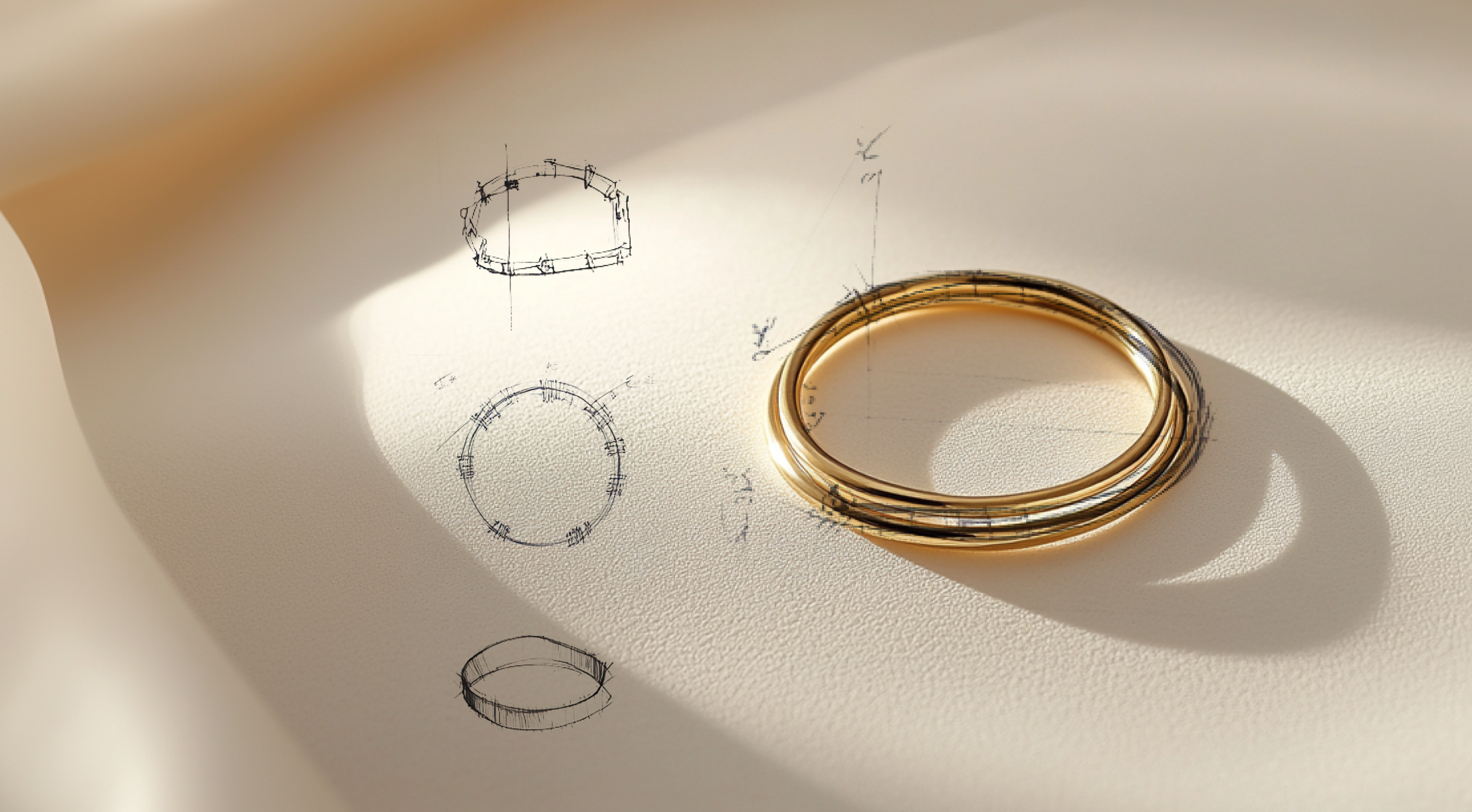
To elevate Oroantico’s presence on social media, I took on the full creative direction of product photography and content creation - capturing the brand’s handmade beauty in a way that felt both intimate and aspirational.


I managed the end-to-end visual process, including shooting, styling, photo editing, and color grading for Instagram and seasonal campaigns.
The imagery was designed to feel organic and refined—highlighting subtle textures, natural light, and the thoughtful design behind every piece.


